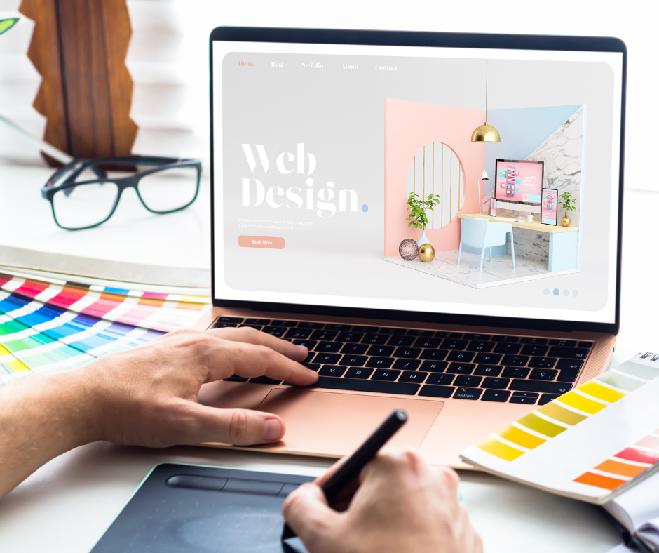
Web design stands as the unsung hero orchestrating this symphony of virtual experiences. Today, we delve into the heart of web design, uncovering the secrets behind mastering the art of crafting engaging content layouts that captivate, resonate, and inspire action. As we navigate the ever-evolving landscape of the online sphere, it becomes evident that the key to a successful web presence lies in the delicate dance between aesthetics and usability. Web design transcends mere visual appeal; it is the silent storyteller that guides users through a seamless narrative, leaving them spellbound at every turn. In this blog post, we embark on a journey to unravel the intricacies of creating content layouts that not only catch the eye but also keep visitors glued to their screens, craving more. Join us as we unearth the hidden gems of web design, exploring how the fusion of creativity and strategy culminates in an unforgettable digital experience.
The Fundamentals of Web Design: Balancing Aesthetics and Functionality
When it comes to web design, finding the perfect balance between aesthetics and functionality is crucial. A visually stunning website may catch the eye, but if it fails to deliver a seamless user experience, visitors will quickly lose interest. On the other hand, a highly functional website with a lackluster design may fail to engage users and leave them feeling uninspired.
So how do we strike this delicate balance? It all starts with understanding the fundamentals of web design. At its core, web design is about creating an interface that not only looks good but also works intuitively. This means considering factors such as user behavior, visual hierarchy, and responsive design.
Understanding User Behavior: Designing Layouts for Engagement
One of the key aspects of web design is understanding how users behave when they visit a website. By analyzing user behavior patterns, designers can create layouts that are tailored to engage and captivate visitors.
For example, studies have shown that users tend to scan websites in an F-shaped pattern, focusing on the top left corner first before moving their gaze horizontally across the page. Understanding this behavior allows designers to strategically place important information and calls-to-action in these prime areas.
In addition to eye-tracking patterns, designers also need to consider how users interact with different devices. With the rise of mobile browsing, it’s essential to create layouts that are responsive and adapt seamlessly across various screen sizes.
Visual Hierarchy: Guiding Users Through Intuitive Content Arrangement
A well-designed layout guides users through content in a logical and intuitive manner. This is where visual hierarchy comes into play. By using elements such as size, color, contrast, and typography effectively, designers can create a clear hierarchy that directs users’ attention to the most important information.
For example, using larger fonts and vibrant colors for headings and subheadings can help users quickly identify key sections of the website. Contrast can be used to highlight important elements or create visual interest. By carefully arranging content and utilizing whitespace, designers can create a sense of balance and harmony that enhances the overall user experience.
Responsive Design: Ensuring Seamless User Experience Across Devices
In today’s digital landscape, it’s no longer enough to design for desktop screens alone. With the increasing use of smartphones and tablets, websites must be responsive and adapt to different devices seamlessly.
Responsive design involves creating layouts that automatically adjust based on the screen size and orientation. This ensures that users have a consistent and enjoyable experience regardless of whether they’re browsing on a desktop computer or a mobile device.
By utilizing fluid grids, flexible images, and media queries, designers can create websites that are not only visually appealing but also highly functional across all devices. This adaptability is crucial in capturing and retaining user attention in an increasingly mobile-driven world.
Conclusion: Elevating Your Web Design Game with Engaging Content Layouts
In conclusion, mastering the art of web design requires striking a delicate balance between aesthetics and functionality. By understanding user behavior, designing layouts for engagement, implementing visual hierarchy techniques, and ensuring responsive design, designers can create captivating content layouts that leave a lasting impression on visitors.
Crafting engaging web content layouts is not just about making things look pretty; it’s about creating an immersive digital experience that resonates with users. So whether you’re revamping an existing website or starting from scratch, remember to prioritize both aesthetics and functionality in your web design journey. By doing so, you’ll be well on your way to crafting engaging content layouts that captivate and inspire action.
Web Hosting Tutorials is your go-to online resource for mastering web hosting and website management. From beginner-friendly WordPress guides to advanced server administration tutorials, we offer a comprehensive suite of educational content to empower your online presence. Elevate your web skills with our expertly designed tutorials and become confident in navigating the complex world of web hosting.